BASED IN TAURANGA · WORKING WITH WEDDING BUSINESSES ACROSS NEW ZEALAND & WORLDWIDE
Wedding Business Branding New Zealand
Strategy-Led Branding for Wedding Professionals Stepping into a More Premium Market
If your work has evolved but your brand hasn’t caught up, you’re likely feeling the gap.
You may notice:
Your visuals feel polished, but not distinctly premium
Enquiries don’t always reflect your pricing or positioning
You’re explaining your value more than you should have to
Your website doesn’t feel aligned with the level you now operate at
At Poppyseed Design, I create refined, strategy-led brands for established wedding professionals across New Zealand who are ready to be seen at the level they truly operate.
Where Creativity Meets Clarity
Branding should do more than look beautiful.
It should:
Reflect the level of service you deliver
Attract clients who value quality over cost
Position you confidently within the premium wedding market
Support your business growth long-term
With over 20 years of design experience and a deep understanding of the wedding industry, my approach blends artistry with strategy.
Because refined design without positioning is simply decoration.
Every brand begins with clarity, so that what we create feels intentional, elevated, and unmistakably aligned.
Strategic Wedding Business Branding Services
Each service is designed to support wedding professionals at different stages of growth.
Whether you need strategic clarity, a full brand repositioning, or a website aligned with your next chapter, we begin with intention.
I work with a limited number of wedding professionals each year to ensure every project receives the strategic depth it deserves.
01. Strategic Brand Audit
For wedding businesses who feel stuck at a certain level and need expert clarity before committing to a full rebrand.
This is not a surface-level review.
It’s a consultant-led diagnosis of what’s holding your brand back, and what needs to shift to support growth.
THIS IS FOR YOU IF
You feel your brand is holding you at a certain level
You’re attracting enquiries that don’t reflect your pricing
You sense misalignment but aren’t sure where it’s coming from
You want expert clarity before investing in a full rebrand
You’re ready to stop guessing and start making strategic decisions
WHAT'S INCLUDED
A strategic review of your positioning, messaging, and visual identity
Website and key touchpoint analysis
Alignment review against your growth goals and target market
A recorded walkthrough with detailed insight
A concise written summary with prioritised next steps
A follow-up call for clarity and direction
OUTCOME
Clear understanding of what’s holding your brand back
Strategic direction tailored to your stage of growth
Confidence in your next investment decision
A roadmap to move from uncertain to aligned
INVESTMENT
From $1,750 + GST
(50% deposit required to secure your audit date)
This investment is credited toward The Signature Wedding Brand if you move forward within 30 days.
02. The Signature Wedding Brand
A full strategic repositioning for established wedding professionals ready to step confidently into a more premium market.
This is where your brand shifts from established to unmistakably positioned.
This is not a logo refresh.
Designed for planners, venues, florists, photographers, and creative founders who:
Have outgrown their current brand
Are no longer willing to compete on price
Want their visual identity to match their expertise
Are stepping into a new level of growth
Are no longer willing to look like everyone else in your market
THIS IS FOR YOU IF
You’ve outgrown your current brand
You’re ready to step into a more premium market
You want your visuals to reflect your expertise
You’re attracting work, but not always the right work
You’re committed to long-term positioning, not short-term trends
You’re no longer willing to look like everyone else in your market
WHAT'S INCLUDED
In-depth brand strategy and positioning development
Audience clarity and value alignment
Creative direction and visual identity design
Refinement rounds aligned to strategy
Comprehensive brand guidelines
Foundational brand collateral (business cards, email signature, social assets)
Structured rollout support
OUTCOME
A brand that reflects where your business is going
Clear differentiation within the wedding market
Increased alignment between pricing and perception
Greater confidence in how you show up
A cohesive foundation to support future growth
INVESTMENT
From $6,500 + GST
Payment Plan Available
03. Strategic Website Design & Alignment
For wedding brands ready for a digital presence that matches their new positioning.
Your website should do more than showcase your work.
It should:
Communicate your value clearly
Attract aligned enquiries
Support premium pricing conversations
Convert interest into considered enquiries
Available as a standalone service or alongside The Signature Wedding Brand.
THIS IS FOR YOU IF
Your website no longer reflects your level of service
You’ve rebranded and need digital alignment
You’re ready to improve enquiry quality
You want a website that supports premium positioning
You understand that conversion is strategic, not accidental
WHAT'S INCLUDED
Strategic website structure and content guidance
Design aligned with your refined brand identity
Conversion-focused structure designed to improve enquiry quality
Mobile optimisation
Basic SEO foundations
Launch support
OUTCOME
A digital presence that reflects your elevated brand
More aligned enquiries
Clear communication of value
A cohesive experience from first impression to enquiry
INVESTMENT
From $4,500 + GST
Custom proposals provided based on scope.
A Strategic, Considered Process
Every branding journey follows a structured, collaborative approach designed to deliver clarity first, then creativity.
STRATEGIC CLARITY
So your brand reflects your next level of growth.
VISUAL IDENTITY DEVELOPMENT
So you feel proud directing clients to your website and materials.
REFINEMENT & ROLLOUT
So every touchpoint feels cohesive, intentional, and elevated.
The result is not just a new brand, but a renewed sense of alignment and authority in how you show up.
What Changes When Your Brand Aligns
When your branding reflects your true level:
You stop second-guessing how you’re perceived
Enquiries become more aligned with your pricing
Collaborators see you as a peer
You feel confident stepping into more premium spaces
You spend less time explaining your value
Pricing conversations feel easier and more aligned
You attract clients who value quality over cost
This is what strategic alignment creates.
Client Feedback
Real words from a recent client.
UNDERSTOOD MY VISION
Amy has been one of the most patient and intuitive suppliers I’ve ever worked with. From our very first meeting, she truly “got me.” She understood my vision and translated it into a thoughtful branding strategy and website I’m genuinely proud of.
Her attention to detail, creative thinking, and honesty throughout the process made such a difference. Even when our direction shifted, Amy adapted seamlessly, developing a brand that feels aligned, future-focused, and built to support real growth.
I’m confident this investment has future-proofed my business, and I’m incredibly grateful.
Anita Gatley - Desire to Travel
Selected Brand Work
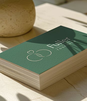
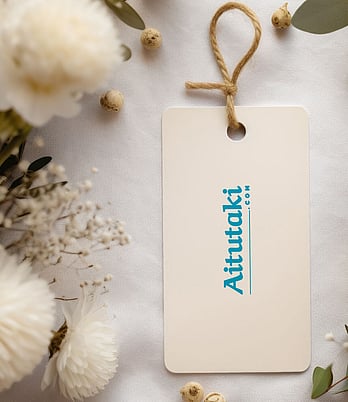
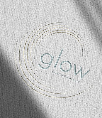
A considered selection of recent wedding business branding and website projects.
Frequently Asked Questions
IS THIS JUST LOGO DESIGN?
No. Branding projects are approached strategically and holistically.
Rather than designing a logo in isolation, we create a cohesive brand identity that supports your business, positioning, and long-term growth.
IS THIS SERVICE SUITABLE FOR NEW WEDDING BUSINESSES?
This service is best suited to established wedding professionals who are ready to elevate their brand and attract more aligned clients.
If you’re newly established, I’m happy to advise whether this is the right time or suggest a more suitable starting point.
DO YOU WORK WITH WEDDING BUSINESSES OUTSIDE NEW ZEALAND?
Yes. While Poppyseed Design is based in New Zealand, I work with wedding professionals across New Zealand and internationally.
All projects are managed remotely with a calm, guided process.
DOES BRANDING INCLUDE WEBSITE DESIGN?
Branding and website design are offered as separate services.
This allows each project to be approached with clarity and focus, while ensuring your brand identity is fully established before moving into website design.
HOW LONG DOES THE BRANDING PROCESS TAKE?
Timelines vary depending on the scope of the project, but branding typically unfolds over several weeks.
This considered pace allows time for strategy, refinement, and thoughtful decision-making.
HOW DO I GET STARTED?
The first step is an initial conversation to explore your goals, where your brand is currently sitting, and what level of support will best serve your business.
Ready to Step Into a More Refined Position?
If your work has evolved and your brand needs to follow, this is where we begin.
If your brand no longer reflects your level of expertise, staying where you are isn’t neutral, it’s limiting.


