Shift Up Tuning Brand Design
Client
Brand Design
The client asked me to create a full brand design package for Shift Up Tuning, a brand-new business.
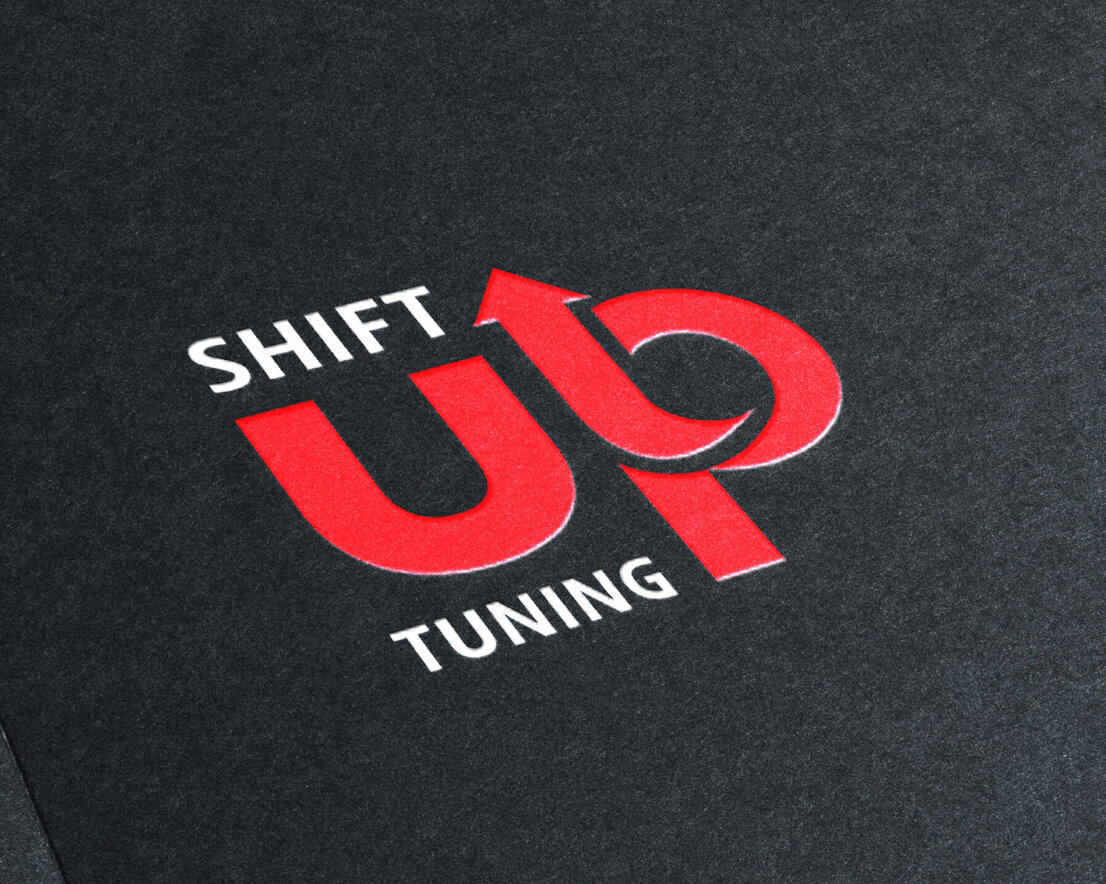
I started the brand design by working on the logo design first. I liked the idea of using the word “up” and using it to create an arrow, making it into an icon in some way.
I decided to keep the text simple, using a modern but easy-to-read typeface, for the words “shift” and “tuning.” They seemed to balance well with the “up” creating a space for them to sit in.
In a discussion with the client about brand design and colours, we decided red would be good to use as it represents power and speed, and using a black background really helped the logo stand out.
I also designed business cards, and these utilised the brand design colours - making the background black to help the information stand out.
The red colour was used for icons and information, and the white was used to break up the colours.
The brand design required another element, so I sourced stylised car graphics. One was used on the front of the business card design with a different graphic on the reverse. This sat well with the contact information next to it.
As part of the brand design package, the client required labels too. These were a small square design and would be stuck onto the customers’ car once they had a vehicle tune completed.


Let's create your brand design.
Get in touch today.

I work with amazing clients in the wedding industry by creating beautiful wedding graphic design collateral that showcases them to their best ability.
Brochure design
Business card design
Catalogue design
Flyer design
Invitation design
Menu design
Poster design
Advert design
Website design
Website refresh or update
RSVP design
Signage design
Table number design
Place name design
Pocketfold wallets
Seating chart design
Gift tags/favour design
Proposal boxes
Thank you cards
Menu design

